Disclaimer
Description
Ever feel like your mobile site is stuck in the dial-up era while everyone else is zooming around on 5G? You’ve poured blood, sweat, and maybe a few tears into your site, but mobile users are still bouncing faster than a bad check. Enter Accelerated Mobile Page Layouts (forked from the genius of Ahmed Kaludi and Mohammed Kaludi’s work on AMP Layouts, mind you!).
Think of it as giving your mobile site a rocket booster, minus the actual rocket (and the potential for fiery explosions). It’s all about whipping your pages into shape for those tiny screens, making them load faster than you can say ‘mobile-first.’
This isn’t just about speed, though. We’re talking about crafting slick, user-friendly experiences that keep visitors glued to your content. No more clunky layouts or endless scrolling – just pure, unadulterated mobile bliss. So, if you’re ready to ditch the mobile blues and embrace the future of fast, beautiful mobile pages, buckle up! We’re about to dive deep into how Accelerated Mobile Page Layouts can transform your site from a mobile mess to a mobile masterpiece. No actual masterpieces will be harmed in the process.
Ready to supercharge your mobile site? Let’s get started!
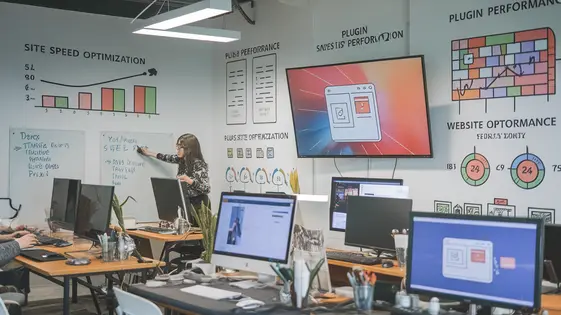
Understanding the Need for Speed (and Mobile-First Design)
Mobile page speed is paramount. More users access the web via mobile than desktop. Google prioritizes mobile-first indexing. This means Google primarily uses the mobile version of a website for indexing and ranking. Ignoring mobile speed impacts search visibility. User expectations are high. Slow loading times lead to frustration. Statistics show a direct correlation between page load time and bounce rate. A few seconds can significantly impact conversions and revenue. Mobile-first design addresses this. It’s about designing for mobile first, then scaling up. This ensures an optimal experience on smaller screens. It’s no longer optional; it’s a necessity. Optimized layouts and content delivery are vital. Images should be compressed. Code should be minimized. Server response times must be fast. Prioritizing these elements leads to improved user satisfaction and better business outcomes. Mobile users expect seamless browsing. Speed and usability are crucial components of that experience. Accelerated Mobile Page Layouts addresses these challenges by streamlining mobile optimization. It builds upon concepts already proven effective by solutions like Ahmed Kaludi and Mohammed Kaludi’s AMP Layouts.
New Gadget: The TechSphere 3000
The TechSphere 3000 is a revolutionary new gadget that seamlessly blends technology and convenience. Its core functionality revolves around simplifying daily tasks through intelligent automation. Key features include voice-activated control, a holographic display, and integrated AI assistant. It boasts compatibility with a wide range of smart home devices, allowing users to manage their entire ecosystem from a single interface. The sleek, ergonomic design makes it both aesthetically pleasing and comfortable to use. Initial reviews praise its user-friendly interface and powerful processing capabilities. It is expected to be a game-changer in the world of personal technology.
Customization Without the Code: Unleashing Your Inner Designer
Customizing your mobile presence doesn’t require coding expertise. Easily tailor pre-designed layouts. Modify colors using a visual palette. Select fonts that resonate with your brand. Changes are instantly reflected, offering a live preview.
The system manages responsive behavior automatically. Layouts adapt to various screen sizes. Ensure a consistent user experience across phones and tablets.
For more advanced customization, inject custom CSS. Add specific styles to elements for unique branding. Include JavaScript snippets for interactive features. This extensibility opens possibilities without overhauling the structure.
Create user-friendly mobile designs by prioritizing clarity. Keep navigation intuitive. Use concise text and high-quality images. Test your designs on different devices. Aim for a visually appealing and performant mobile experience respecting the original AMP Layouts, and the foundations laid by Ahmed Kaludi and Mohammed Kaludi.
Performance Optimization: Making Your Mobile Site Scream (with Speed)
Mobile page speed is vital. It impacts user experience and search rankings. Mobile-optimized layouts can make a huge difference. This plugin helps create layouts prioritizing performance. Image optimization is critical. Serve scaled images. Use modern formats like WebP. Lazy loading prevents loading images until they are needed. This saves bandwidth and improves initial load time. Minification reduces file sizes by removing unnecessary characters from HTML, CSS, and JavaScript. Leverage browser caching. Caching stores static assets on the user’s device. This reduces server load and speeds up subsequent page loads. Consider a Content Delivery Network (CDN). A CDN distributes your content across multiple servers. This reduces latency for users around the world. Optimize your server-side code. Slow server response times can negate front-end optimizations. Measure your mobile page speed using tools like PageSpeed Insights. Identify areas for improvement. The layouts integrate with performance monitoring tools. Track key metrics and identify bottlenecks. Remember, every millisecond counts. Regular optimization is essential for peak performance. Proper configuration will result in faster mobile experience thanks to Ahmed Kaludi, Mohammed Kaludi’s, dedication to performance.
Troubleshooting and Best Practices: Avoiding Mobile Mayhem
Accelerated Mobile Page Layouts can occasionally present challenges. Conflicts can arise if other plugins or themes alter the same page elements. Deactivate plugins one-by-one to identify the culprit. Theme conflicts often necessitate switching to a default theme temporarily. Debugging mobile layouts requires using browser developer tools, especially the mobile emulator. Inspect element styles to pinpoint layout issues.
Accessibility is paramount. Ensure sufficient color contrast. Use semantic HTML. Provide alternative text for images. Test keyboard navigation. Validate your HTML. For multi-language sites, ensure proper language attributes are implemented to comply with accessibility guidelines. Test your mobile layouts rigorously. Use real devices and browser emulators. Consider services that automate testing across various platforms.
Further learning resources include the official AMP project documentation and community forums. Remember to always respect the original AMP Layouts and Ahmed Kaludi, Mohammed Kaludi.
FAQ:
- Why is my layout broken after activating another plugin? Plugin conflicts are common. Disable other plugins to identify the source of the problem.
- How do I test on different devices? Use browser developer tools or services like BrowserStack.
Final words
So, there you have it – Accelerated Mobile Page Layouts, your secret weapon in the battle for mobile supremacy. It’s more than just a plugin; it’s a toolkit for crafting lightning-fast, visually stunning mobile experiences that will keep your visitors engaged and coming back for more. Remember Ahmed Kaludi and Mohammed Kaludi’s work on AMP Layouts when you’re building with Accelerated Mobile Page Layouts, it’s built on their foundation!
We’ve covered everything from the crucial importance of mobile speed to the nitty-gritty details of customization and optimization. You’ve learned how to transform your site from a mobile eyesore to a mobile masterpiece, all without needing a PhD in computer science (although, if you have one, that’s cool too).
But knowledge is only half the battle. Now it’s time to put these insights into action and start building the mobile site of your dreams. Ditch the frustration, embrace the speed, and watch your mobile traffic (and conversions!) soar.
The final takeaway? Don’t let your mobile site be an afterthought. With Accelerated Mobile Page Layouts, you can create a mobile-first experience that delights your users and drives results. So go forth, optimize, and conquer the mobile world!
Latest changelog
Changelog
Demo Content
Comments
Request update
About
- 1.9.41
- 12 hours ago
- April 19, 2025
- Ahmed Kaludi, Mohammed Kaludi™
- Page Builder
- GPL v2 or later
- Support Link