Disclaimer
Description
Ever feel like building page layouts with native tools is like trying to herd cats wearing mittens? We all love the flexibility of the native editor, but sometimes you need a little more control, a little more structure, and a lot less frustration.
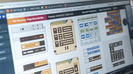
Enter ArchiCraft, the plugin that’s like giving the native editor a shot of espresso (the good kind, not that gas station sludge). Forked from the brilliant minds behind Structeezy, ArchiCraft brings a grid-based, drag-and-drop interface to your content creation, so you can stop wrestling with shortcodes and start crafting pixel-perfect designs without the headache. It’s time to ditch the design limitations of the native editor and start building the web pages you’ve always dreamed of, even if your coding skills are more “copy-paste” than “command-line wizard”.
ArchiCraft isn’t just another page layout tool; it’s your creative co-pilot. Whether you’re a seasoned developer or a newbie, this plugin empowers you to build complex, responsive layouts with an intuitive visual interface. Think of it as the bridge between your creative vision and the final product, ensuring that what you see is exactly what your visitors get. Get ready to unleash your inner design genius, because with ArchiCraft, the only limit is your imagination (and maybe your server’s bandwidth, but let’s not dwell on the small stuff).
So, if you’re ready to say goodbye to layout chaos and hello to design zen, buckle up! We’re about to dive into the world of ArchiCraft, where beautiful, functional pages are just a drag and a drop away.
Understanding the Grid System: Your New Best Friend
Let’s talk grids. Forget those rigid, soul-crushing systems you’ve battled before. Our grid is different; it’s flexible and actually enjoys being bent to your will. Think of it as your layout-building buddy, not a digital drill sergeant.
Why a grid, anyway? Because without one, you’re basically herding cats on a screen. Things end up misaligned, proportions are wonky, and your design screams, “I was made in MS Paint!” Nobody wants that.
Our system lets you define the number of columns and rows. You decide how much space each element takes up. Want a big, bold header spanning the whole width? Easy. Need a sidebar that’s just a sliver? Done. This is about your vision, not pre-set templates.
Imagine a 12-column grid. You can make one element take up 6 columns, another 3, and then use the last 3 for something else. Or maybe you create two rows, splitting it up even more. The combinations are endless, like a digital Lego set. It’s also responsive! Your grid adapts to different screen sizes.
This avoids those tedious, manual adjustments that suck up your time. Fewer headaches, more design freedom. Think of the possibilities!
Drag-and-Drop Like a Pro: Stop Coding, Start Creating
Okay, so you’ve mastered the grid (kudos!). Now, let’s talk about moving stuff around inside that grid. Drag-and-drop! It’s not just for sending angry emails to the trash anymore.
ArchiCraft lets you grab elements and fling them across the canvas. Want that image on the left? Just drag it. Need that button a little higher? Drop it! It’s shockingly simple.
But here’s the secret sauce: precision. We’re not talking about just haphazardly tossing things around. You can resize elements by grabbing their edges. No more guessing if that image is exactly the right size – just visually tweak it until it’s perfect.
The alignment guides are your friends! As you drag, subtle lines appear, showing you when your element is perfectly aligned with others. Forget about manually tweaking margins and padding! These guides are there to ensure professional results, without professional-level effort.
Want to make sure your masterpiece looks great? Try different browsers! The drag-and-drop functionality is designed to play nice with most modern browsers. It is all designed to give you the most creative freedom.
Responsive Design: Making Your Site Look Good on Every Screen (Even That Tiny One)
So, you’ve mastered the art of drag-and-drop. Awesome! But what happens when your beautiful creation gets viewed on a device smaller than a postage stamp? That’s where responsive design saves the day (and your website’s reputation).
ArchiCraft anticipates the multi-screen world. It gives you simple ways to adapt your layouts.
First, there’s the basic scaling. Think of it like zooming out. Everything shrinks to fit, but it’s not always pretty.
Then, we get fancier. ArchiCraft lets you define different layouts for different screen sizes. Want that three-column grid to become a neat stack on mobile? Easy peasy. You can tweak element sizes, hide entire sections, or even swap out images for mobile-optimized versions. The controls are intuitive, like having a design editor built into your design editor.
Pro tip: Don’t just make it work on mobile. Make it shine. Mobile users are often on the go. Make their experience fast and delightful.
Customization Options: Making It Yours (Without Breaking Everything)
Alright, so you’ve got a site that works. Congrats! Now, let’s make it yours. Because nobody wants a website that looks like everyone else’s, right? Think of it as giving your digital home a personal touch – maybe adding some tasteful (or delightfully gaudy) wallpaper.
First up: colors! Dive into the settings and unleash your inner interior designer. You can tweak pretty much everything. Buttons, backgrounds, text – the whole shebang. Aiming for minimalist chic? Go for it. Yearning for neon overload? I’m not judging (much). But maybe check it on a phone. Remember that responsiveness thing from last chapter? Yeah, make sure your color scheme doesn’t, like, hurt people’s eyes on smaller screens.
Fonts are next. Find a typeface that sings to your soul. Or, at least, one that’s legible. Please. There are tons of options to choose from. Serif, sans-serif, maybe even something a little… out there. Just keep it consistent. A ransom note aesthetic might be fun, but it’s probably not great for business.
Spacing is surprisingly important. Too much, and your site feels empty and awkward. Too little, and it’s a claustrophobic nightmare. Play around with padding and margins until everything breathes nicely. Think of it as digital feng shui.
Now, for the brave souls: custom CSS. This is where you can truly unleash your inner coding wizard. Want to make your logo spin when someone hovers over it? CSS can do that. Want to add a subtle, pulsating glow to your buttons? CSS is your friend. Just… be careful. A little CSS can go a long way, and a lot of CSS can break everything. Seriously. Always back up your work before diving in. And maybe keep a browser tab open to a CSS tutorial. You know, just in case.
Remember, customization is a journey, not a sprint. Experiment. Play around. Have fun. And if you accidentally turn your website into a pixelated Jackson Pollock painting, don’t panic. That’s what the undo button is for. (Or, you know, those backups we talked about).
Troubleshooting and Best Practices: When Things Go Wrong (and How to Fix Them)
So, you’ve built your masterpiece with ArchiCraft, but things are going a bit wonky? Don’t panic! We’ve all been there. Think of this chapter as your digital first-aid kit.
First off, the dreaded white screen of doom. This usually happens when ArchiCraft clashes with another plugin. Our advice? Play detective! Deactivate your plugins one by one, checking after each deactivation to see if ArchiCraft starts behaving. When it does, you’ve found your culprit!
Another common issue: things looking slightly off. This could be due to caching. Clear your cache (both the browser’s and any caching plugins) and see if that fixes it. If not, double-check your custom CSS from the last chapter. A misplaced semicolon can wreak havoc!
Performance woes? Large images are often the culprit. Optimize those babies! Smaller images mean faster loading times and happier visitors. Also, consider using a content delivery network. This distributes your site’s files across multiple servers, reducing the load on your server and speeding things up.
Conflicts, conflicts everywhere! To minimize conflict with other plugins, stick to recognized coding standards, and keep everything updated (ArchiCraft and everything else). Think of it as keeping all the children in the sandbox playing nicely together. Sometimes, though, a plugin just refuses to cooperate. Consider finding an alternative plugin that does the same job but plays well with others.
Best practices for smooth sailing: Before making major changes, back up your site! You’ll thank us later. Also, test changes in a staging environment (a clone of your site) before pushing them live. This prevents your visitors from seeing a broken site.
If all else fails, contact our support team. We’re here to help, and we’ve seen it all before (probably!). Just remember to provide as much detail as possible about the issue. The more information you give us, the faster we can diagnose the problem and get you back on track. Now, go forth and build amazing things!
Final words
So, there you have it! ArchiCraft isn’t just another plugin; it’s your secret weapon for conquering the design challenges. It’s time to say goodbye to the days of wrestling with clunky layouts and hello to a world where your creative vision can come to life with ease. We’ve covered everything from understanding the grid system to mastering the drag-and-drop interface, creating responsive designs, and customizing every detail to match your brand. And yes, we’ve even touched on what to do when things go a little sideways (because let’s be honest, it happens to the best of us).
Remember, the key to success with ArchiCraft is to experiment, explore, and don’t be afraid to push the boundaries of what’s possible. After all, the best designs often come from a little bit of happy accidents and a whole lot of creativity. With ArchiCraft, you have the power to transform the native editor into a design powerhouse, creating stunning pages that not only look great but also deliver an exceptional user experience. The possibilities are endless and we cannot wait to see what you will create.
So, what are you waiting for? It’s time to unleash your inner designer and start building the web pages you’ve always dreamed of. With ArchiCraft, the only limit is your imagination. Happy designing!
Latest changelog
Changelog
Demo Content
Comments
Request update
About
- 1.2.3
- 3 seconds ago
- April 19, 2025
- Cédric Bontems - The Web Forge™
- View all from author
- Page Builder
- GPL v2 or later
- Support Link