Disclaimer
Description
Ever stared at a mountain of raw form data and thought, “There has to be a better way than spreadsheets?” Well, friend, you’ve stumbled upon the answer. Say hello to the Block Builder Add-On, the tool that takes your form entries and transforms them into beautiful, insightful charts and graphs, right within your site’s block editor. Forget wrestling with clunky interfaces or exporting data to third-party services. This add-on brings data visualization directly to your content creation workflow. It’s like having a data analyst living inside your website, minus the coffee breaks and awkward small talk. We’re talking about turning tedious numbers into visually appealing stories that your audience will actually want to engage with. Why settle for boring tables when you can have dynamic, interactive charts that make your point with a punch? Get ready to unlock the power of visual storytelling and make your data sing – all without writing a single line of code (unless you’re into that sort of thing, then go wild!). So, buckle up, because we’re about to dive into how this tool can revolutionize the way you present data on your site, one beautiful chart at a time.
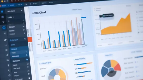
Unleash the Power of Visual Data: Chart Types
The Block Builder Add-On provides a diverse range of chart types to suit various data representation needs. Each chart excels at highlighting specific aspects of your data. Let’s explore the options.
Bar charts are ideal for comparing values across different categories. Imagine showcasing website traffic sources or product sales per region. The Block Builder Add-On simplifies bar chart creation with intuitive data mapping and customization. Real-world usage includes visualizing survey results or tracking monthly expenses.
Pie charts effectively display proportions of a whole. They’re perfect for illustrating market share or budget allocation. With the Block Builder Add-On, creating visually appealing pie charts is effortless, allowing clear labeling and color customization. Consider using it to represent customer demographics or resource distribution.
Line charts are best for showcasing trends over time. Visualize website performance, stock prices, or temperature fluctuations with ease. The Block Builder Add-On offers smooth line rendering and customizable axis labels. A common application is tracking website visits over a year or monitoring project progress over time.
Beyond these, the add-on supports other chart types like area charts, and scatter plots, each designed for specific data analysis and presentation requirements. Choose the chart that best reflects your data’s story. The Block Builder Add-On empowers you to transform raw form data into insightful visuals.
Block Editor Integration: Chart Creation Made Easy
Creating compelling charts is now simpler than ever. The block editor integration offers a seamless workflow. Adding a chart block is as easy as adding any other content block. Once inserted, you can directly link it to your data source. This connection pulls information from the form entries you specify. No coding is required!
The intuitive interface allows for real-time customization. Choose your desired form and fields. Then, preview the chart immediately within the editor. Customize colors to match your site’s branding. Modify labels for clarity and impact. Adjust titles to accurately reflect the data presented. These adjustments create a chart that is both informative and visually appealing. This integrated experience saves considerable time. It eliminates the need to switch between different interfaces. Data visualization becomes a natural part of your content creation process.
Customization Options: Making Charts Your Own
The true power lies in the ability to tailor the charts to meet specific needs. The Block Builder Add-On offers extensive customization options. Start with color schemes. Choose from pre-defined palettes or create a unique one that aligns with your brand. Control the colors of data series, axes, and labels for visual consistency.
Label formatting options ensure data is presented clearly and concisely. Adjust font sizes, styles, and positions of labels. Decide what information to display on each data point. Axis settings allow control over scaling, increments, and labels. Customize the axis titles and ranges. This helps to properly represent the data and avoid misinterpretations.
Make charts interactive. Implement tooltips that display detailed information on hover. Enable zoom and pan features for exploring data in depth. Users can highlight specific data points or series. Download the chart as an image file. By leveraging these customization options, charts transform into powerful communication tools. They reflect your brand identity and deliver data insights effectively.
Real-World Applications: Showcasing the Power of Data Visualization
The Block Builder Add-On transcends simple charting. Consider visualizing survey results. Instead of poring over spreadsheets, transform responses into clear bar graphs showing popular choices. Pie charts can illustrate demographic breakdowns. See, at a glance, which groups responded most. Track sales performance by turning raw numbers into compelling line graphs. Identify trends, peak seasons, and areas needing improvement. Data visualization isn’t just for big corporations. Small businesses can use it to monitor website analytics. Display website traffic over time. Understand which pages are most popular. This informs content strategy and marketing efforts. Visuals can be embedded directly onto pages. Present progress reports in a visually engaging way, far more impactful than simple tables. These examples highlight data’s persuasive power. They show how visuals can transform raw data into actionable insights for diverse needs. The gravity+ of insightful visuals makes data more accessible.
Troubleshooting and Support: Getting the Help You Need
Even with a user-friendly interface, occasional hiccups can occur. Let’s address common snags you might encounter while building your data visualizations.
Chart Not Displaying? First, ensure your source form data is complete and accurate. Incomplete or incorrect data can prevent proper chart rendering. Double-check your field mappings within the Block Builder settings. Are you pointing to the correct form fields?
Data Discrepancies? If your chart data doesn’t match the source form entries, verify your filters. Ensure your data filters are correctly configured to include the intended submissions. Check your form’s confirmation and notification settings to rule out issues in data submission.
Block Editor Issues? If the Block Builder isn’t functioning correctly within your page builder, confirm you’re using compatible versions. Review the add-on’s documentation for version compatibility details.
We are committed to your success. The documentation (link) provides comprehensive guides and FAQs. If you require further assistance, our dedicated support team is ready to help. Visit our support forum (link) to connect with our team and other users.
Final words
So, there you have it! The Block Builder Add-On isn’t just another charting tool; it’s your secret weapon for transforming raw form data into captivating visual stories. By seamlessly integrating with the block editor and offering a wide range of customization options, this add-on empowers you to create dynamic, insightful charts that resonate with your audience. Forget the days of exporting data to external services or wrestling with complex charting software. Now, you can create stunning visualizations directly within your content creation workflow, saving you time and boosting engagement. Whether you’re visualizing survey results, tracking key performance indicators, or simply trying to make your data more accessible, the Block Builder Add-On has you covered. It’s time to unlock the power of visual storytelling and make your data truly shine. The ease of use, combined with powerful features, makes this a must-have tool for anyone serious about data presentation. So, what are you waiting for? Start creating compelling charts today and watch your data come to life! And remember, a picture is worth a thousand words, but a well-crafted chart is priceless.
Latest changelog
Changelog
Demo Content
Comments
Request update
About
- 1.0.0
- 2 seconds ago
- April 20, 2025
- gravity+™
- View all from author
- Chart and Graph Add-on
- GPL v2 or later
- Support Link