Disclaimer
Description
Ever feel like your form data is trapped in a digital spreadsheet, yearning for a more…visual existence? Like maybe it wants to break free and become a chart, showcasing trends and insights that would otherwise remain buried under rows and columns? Well, my friend, you’ve stumbled upon the answer to your data’s existential crisis. Get ready to unleash the charting beast with Formidable Charting vs Time Add-On, the plugin that takes your form entries and transforms them into beautiful, insightful, and dare I say, sexy time-based charts.
This isn’t your grandma’s pie chart generator. We’re talking dynamic, interactive visualizations that bring your data to life. Imagine seeing how user engagement spikes on Tuesdays, or how sales figures dip during summer vacation (because everyone’s at the beach, duh). This plugin empowers you to turn raw information into actionable intelligence, all within the comfort of your favorite content management system.
So, buckle up, buttercup, because we’re about to dive deep into the wonderful world of charting. Prepare to have your mind blown (slightly), your data visualized (beautifully), and your reports transformed from boring to brilliant. Get ready to discover how Formidable Charting vs Time Add-On can revolutionize the way you understand and present your data. Let’s get charting!
Unleashing the Power of Time-Based Charts
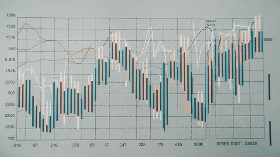
The core functionality of charting with time lies in its ability to transform form entries into meaningful time-based visualizations. It takes dates, times, and related numerical values from your form submissions. It then renders them as charts that reveal trends and patterns across a timeline. This allows you to track changes over days, weeks, months, or even years.
This system supports various data types including date fields, time fields, number fields representing quantities or measurements, and even text fields that can be associated with a specific point in time. Imagine tracking website traffic by plotting page views against dates. Or visualize sales trends by charting revenue figures over each month. You can even monitor user engagement by graphing the number of form submissions received each week.
Visualizing data over time provides key advantages. Trends that are invisible in raw data instantly become apparent. Spikes and dips in activity are easily identifiable, allowing for quick responses to changing conditions. Anomalies that could indicate problems or opportunities are highlighted. This understanding leads to better decision-making, improved efficiency, and a deeper understanding of your data.
Customization Options: Making Charts Your Own
Transforming raw data into insightful visuals requires adaptable tools. This solution provides extensive customization to tailor charts to specific needs. Users can select from various chart types, including line, bar, and area charts, each suited to different data representation goals.
Color schemes are fully customizable. Align chart colors with branding guidelines for a cohesive look. Label formatting options control the appearance of data labels. Control how values are displayed on the chart. Axis configurations allow users to define scales and intervals. Achieve precision in data visualization.
Add chart titles for context. Include legends to clarify data series. Implement tooltips that appear on hover. Enhance user understanding. These elements offer further clarity and depth. Customization enhances the clarity and impact of visualizations. Users can create informative and visually appealing charts with customized aesthetics and functional details.
Dynamic Filtering: Focusing on What Matters
Dynamic filtering enables precise data analysis within your charts. Users can refine displayed data based on various criteria. Date ranges provide a powerful tool. Examine sales figures for a specific month or quarter. Value-based filters isolate key segments. Identify high-performing product categories or customer demographics. Other criteria may include user roles or custom fields.
This adaptable approach facilitates granular investigations. Drill down into specific time periods for detailed scrutiny. Analyze user engagement during a targeted marketing campaign. Pinpoint the drivers behind unexpected performance fluctuations. Use filtering to compare different segments. Compare website traffic from different referral sources.
Dynamic filtering’s core benefit is insight acceleration. Quickly identify trends and outliers. Uncover hidden patterns within your data. Focus on the information that truly matters. This leads to better-informed decisions and optimized strategies.
Integration and Compatibility: Playing Well with Others
The charting solution excels at integrating with various form-building plugins. It seamlessly retrieves form data for visualization. This allows users to transform form submissions into insightful charts and graphs. The strength lies in its ability to directly access and interpret form fields. No manual data import or complex configurations are needed.
Beyond form plugins, the charting solution integrates with other services. This may include analytics platforms for enhanced data analysis or data management systems for streamlined workflows. Such integrations facilitate a more comprehensive understanding of data. They also enable efficient reporting.
While generally robust, occasional compatibility issues may arise. These can usually be resolved through plugin updates or minor configuration adjustments. Consulting the documentation or support resources is recommended for troubleshooting. By leveraging its integration capabilities, users can streamline data analysis and derive actionable insights from their data. This reduces manual effort and improves overall efficiency.
Use Cases and Examples: Seeing It in Action
Let’s explore practical applications of visualizing form data over time. Imagine a blog needing to understand readership trends. By connecting form submission data (like newsletter sign-ups) to our charting tool, a graph can reveal peak interest periods. This helps optimize content release schedules and advertising campaigns.
An e-commerce business can monitor sales performance daily, weekly, or monthly. The charts can display trends in product purchases, identifying top sellers or flagging underperforming items. This enables data-driven decisions about inventory and marketing.
Social media engagement analysis becomes easier too. Visualize the number of comments or shares over specified periods. Spikes in engagement may correlate with specific content or campaigns, informing future strategies.
These examples show how the charting capabilities of GFChart combined with time-based data analysis provide actionable insights across diverse fields. Users can identify patterns, predict trends, and make informed decisions to improve their outcomes. Screenshots showcase the intuitive interface and customization options, highlighting data displayed in various formats for optimal comprehension.
Final words
So, there you have it. Formidable Charting vs Time Add-On is not just another plugin; it’s your data’s new best friend. It’s the tool that takes the mundane and transforms it into the magnificent, the boring into the brilliant. It’s the key to unlocking hidden insights and making data-driven decisions with confidence.
Imagine no more endless scrolling through spreadsheets, no more squinting at tiny numbers, and no more relying on gut feelings. With this plugin, you’ll have a clear, visual representation of your data, empowering you to identify trends, spot anomalies, and make informed choices that drive success. Whether you’re tracking website traffic, monitoring sales performance, or analyzing user engagement, Formidable Charting vs Time Add-On provides the tools you need to gain a competitive edge.
So, what are you waiting for? Stop letting your data gather dust and start bringing it to life. Embrace the power of visualization and unlock the hidden potential within your form entries. Your data will thank you, and your boss will be impressed. It’s a win-win situation, really. The time to chart is now!
Latest changelog
Changelog
Demo Content
Comments
Request update
About
- 0.11
- 2 seconds ago
- April 20, 2025
- View all from author
- Chart Add-on
- GPL v2 or later
- Support Link