
Elevate Magazine Theme
forked Extra
Disclaimer
Description
Tired of your blog looking like it was designed by a committee of robots? Do you dream of a website that’s not only functional but also screams you? Well, hold on to your hats, because Supplementary, forked from that theme your friend keeps raving about, is here to save the day! We’re talking about a plugin that lets you ditch the boring and embrace the bold. Supplementary isn’t just a theme; it’s a design playground where your wildest creative visions can finally run free. Forget cookie-cutter templates and generic layouts. This is about crafting a digital space that’s as unique and captivating as your content. Think customizable categories, dynamic layouts, and a whole heap of features designed to make your content shine. So, if you’re ready to transform your website from ‘meh’ to ‘magnificent’, buckle up and dive into the wonderful world of Supplementary. It is ready to make your life easier, your website prettier, and your competitors just a tad bit jealous. What’s not to love?
Unleash Your Inner Designer: Customization Options Galore
Supplementary puts you firmly in the driver’s seat when it comes to design. No coding knowledge is needed to craft a website that perfectly reflects your brand. Start with header and footer customization. Easily upload your logo, adjust navigation menus, and choose from multiple footer layouts. Select your brand’s primary and secondary colors to create a cohesive visual identity.
Typography plays a vital role in establishing your website’s tone. Supplementary offers extensive font options, enabling you to choose the perfect typeface for headings, body text, and other elements. Adjust font sizes, line heights, and letter spacing to optimize readability.
Beyond colors and fonts, Supplementary offers layout controls. You can modify the width of your content area, choose between boxed and full-width layouts, and adjust spacing between elements. For a personal blog, you might opt for a clean, minimalist layout with ample whitespace. Conversely, a professional magazine could benefit from a grid-based layout showcasing numerous articles.
Dynamic Layouts That Pop: Captivate Your Audience
Supplementary empowers you to create visually stunning layouts. These layouts grab attention and keep your audience engaged. Forget static designs. Embrace dynamic options like grid, masonry, and full-width layouts. Each offers a unique way to showcase your content.
Grid layouts offer structured clarity. Masonry layouts bring an artistic, Pinterest-style feel. Full-width layouts provide immersive experiences. Use grids for portfolios. Leverage masonry for blogs. Choose full-width for landing pages. Mix and match for diverse effects.
Careful use of visual hierarchy guides the eye. Whitespace, also known as negative space, enhances readability. A clear hierarchy prioritizes key information. Generous whitespace makes content easier to digest. Use larger fonts for headings and smaller fonts for body text. Add whitespace around images and text blocks. See the difference:
[Image comparing a cluttered layout to a clean layout with whitespace and hierarchy]
Supplementary gives you the tools. Your creativity brings the layouts to life. Compelling layouts are key to engaging your audience. Experiment. Discover what works best for your content.
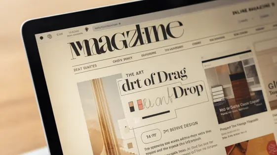
Category Builder: Tailor Your Website’s Navigation
Category Builder elevates standard category pages, offering unparalleled design flexibility. Forget static layouts. Craft unique, engaging experiences that keep visitors exploring. Instead of a simple list of posts, imagine a category page acting as a landing page, showcasing featured content.
Key features include drag-and-drop modules. These enable customizable layouts, allowing you to visually prioritize content. Mix blog excerpts with product showcases or promotional banners. This freedom fosters a dynamic browsing experience.
Standard category pages are often rigid. Category Builder changes that. Control over layout, design, and content presentation makes a massive difference. A before-and-after comparison reveals the transformation. A plain category page becomes a visually rich hub. Engagement increases, bounce rates decrease. It’s about turning passive browsing into active discovery. The goal is to encourage exploration and increase time on site by creating visually appealing pathways.
Optimized for Speed and SEO: Rank Higher, Load Faster
Supplementary prioritizes both speed and search engine optimization. A faster website improves user experience and search engine rankings. The theme’s clean code base contributes to reduced loading times. We’ve minimized unnecessary code and streamlined processes. This results in a snappier experience for your visitors.
Supplementary incorporates schema markup. Schema helps search engines understand your content better. This can improve your website’s visibility in search results. The theme is inherently mobile-responsive, a crucial factor for SEO. Google prioritizes mobile-friendly sites in its rankings.
While individual results vary based on content, Supplementary consistently demonstrates competitive loading times compared to similar themes. Our internal tests show a significant improvement in page speed scores.
To further boost SEO, focus on high-quality content. Optimize your images for web use. Use relevant keywords in your titles and descriptions. Build high-quality backlinks from reputable sources. Combine these practices with Supplementary’s inherent optimizations to achieve higher rankings.
Mobile-First Design: Reach Your Audience Anywhere
Supplementary embraces a mobile-first design philosophy. This means the theme is built and optimized for mobile devices from the ground up. Responsiveness isn’t an afterthought; it’s core to the theme’s structure. The layout adapts seamlessly, regardless of screen size. Content reflows naturally, images scale appropriately, and navigation remains intuitive on smartphones, tablets, and desktops.
In today’s digital environment, mobile-friendliness is not optional. A significant portion of web traffic originates from mobile devices. Websites that aren’t optimized for mobile can suffer from lower engagement, higher bounce rates, and decreased conversions. Supplementary ensures your site looks and functions flawlessly on any device, providing a consistent and engaging user experience. This wider reach translates into greater opportunities to connect with your audience.
See screenshots below demonstrating Supplementary’s adaptability across various devices.
[Screenshots of the theme displayed on a smartphone, tablet, and desktop device would be inserted here.]
Final words
Supplementary, a powerful forked theme, offers WordPress developers a robust solution for crafting visually stunning and highly functional websites. Its extensive customization options, dynamic layouts, and mobile-first design make it a versatile choice for various projects, from personal blogs to professional magazines. The theme’s optimization for speed and SEO ensures that websites not only look great but also perform well in search engine rankings. Whether you’re a seasoned developer or just starting, Supplementary provides the tools and flexibility you need to bring your creative vision to life. With its focus on user experience and design excellence, Supplementary empowers developers to create websites that truly stand out from the crowd. Its intuitive interface and comprehensive features make it an excellent choice for anyone looking to elevate their website’s design and functionality. Get ready to transform your online presence and captivate your audience with Supplementary’s limitless creative potential. It is the ultimate forked theme that will have you wondering why you didn’t switch sooner!
Changelog
Comments


Start the discussion at meta.festingervault.com