Disclaimer
Description
Ever felt like your site’s design is stuck in the dial-up era while the rest of the web is cruising on broadband? Well, hold onto your hats, because we’re diving into Themify Grido, a theme that’s like giving your website a serious shot of espresso. Forget those cookie-cutter layouts that make you yawn just looking at them. This isn’t about fitting in; it’s about standing out, screaming, “Hey, look at me! I’m not boring!”
But wait, there’s more! This theme isn’t just about looking pretty (though it does that exceptionally well). It’s about giving you, the brilliant mind behind the site, the power to mold and shape every pixel to your exact liking. We’re talking granular control, folks. Total domination over your digital domain. Because let’s face it, who wants to be just another face in the crowd when you can be the trendsetter, the innovator, the design guru everyone else is trying to emulate?
So, buckle up as we explore how this theme can turn your web design dreams into a glorious reality. We’re not just talking about a theme; we’re talking about a revolution. Prepare to unleash your inner designer and create a site so stunning, so user-friendly, so downright awesome, that your visitors will have no choice but to click, engage, and keep coming back for more. Are you ready to take your website to the next level?
Unleash the Grid: Mastering Layouts That Don’t Suck
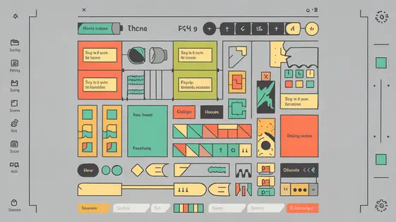
Grid-based layouts offer unparalleled control and flexibility. They are vital for creating visually engaging and functional designs. With this theme, you can structure content into rows and columns, crafting almost any layout imaginable. Consider how you want users to scan content. A well-defined grid directs their eye through the page.
Responsive design is essential. This theme’s grid system allows for adjustments based on screen size. Define how columns collapse or resize on different devices. This ensures optimal viewing on desktops, tablets, and phones. Utilize the theme’s built-in tools for breakpoints and responsive settings.
Explore beyond simple column layouts. Overlap elements, create asymmetrical sections, or use varying column widths to highlight key content. Image galleries can be enhanced by showcasing images in dynamic grid patterns. Product listings benefit from structured, but visually appealing arrangements. Embrace negative space. It provides breathing room and focus. Thoughtful grid design transforms a page from cluttered to captivating. Always preview your designs on multiple devices to ensure responsiveness and visual coherence.
Customization Overload: Tweak Everything, Regret Nothing
The framework’s customization options are extensive. You can modify almost every visual aspect. This allows you to forge a unique brand identity. Start with global settings. These include color palettes and font choices. Consistent use of these elements strengthens your brand. Headers and footers are also highly customizable. You can tailor them to fit your exact needs. Experiment with different layouts and content placements.
For advanced tweaks, custom CSS is your friend. It grants pixel-perfect control. You can override default styles. Remember to use CSS efficiently. Overusing it can lead to maintainability issues. Inspect the elements carefully. Target them with specific CSS rules. Limit the use of !important unless absolutely necessary.
While powerful, customization has limits. Very complex designs might require custom templates. These go beyond the scope of the theme’s settings. Plan your design accordingly. Understanding the framework’s structure is vital. It ensures smoother customization. You can extend theme functionality using child themes. This prevents changes from being overwritten during updates.
Responsive Design: Because Mobile Users Exist (and They’re Judging You)
Websites absolutely must adapt to different screen sizes. Thankfully, the theme offers built-in responsive design features. It utilizes a grid system that fluidly adjusts to various devices. Elements reflow and resize intelligently, ensuring content remains readable and accessible, whether on a desktop or a phone.
Testing is key. Use browser developer tools to emulate different devices. Check for issues like text overflow, image distortion, or overlapping elements. Consider real-world testing on actual phones and tablets for the most accurate results.
Common challenges include managing image sizes and dealing with complex layouts. The theme allows setting different image sizes for different devices. For intricate designs, consider using the theme’s builder to create device-specific layouts.
For example, a three-column layout on desktop might become a single-column layout on mobile for optimal viewing. Utilize the responsive visibility options to show or hide elements based on screen size. Proper responsive design means a better user experience, leading to higher engagement.
Performance Optimization: Make Your Site Load Faster (or Else!)
Website speed matters. Slow loading times frustrate users. They also hurt your search engine rankings. Optimizing performance is crucial. Start with image optimization. Use tools to compress images without sacrificing quality. Properly sized images are essential. Caching is another vital component. Implement browser caching to store static assets. This reduces server load. Minify CSS and JavaScript files. Remove unnecessary characters and whitespace. Smaller files load faster. Consider using a content delivery network (CDN). CDNs distribute your website’s content across multiple servers. This improves loading times for users worldwide.
Common performance bottlenecks include large images and unoptimized code. Address these issues promptly. Use website speed testing tools to identify problem areas. Many plugins can help improve website speed. Choose plugins carefully to avoid conflicts and bloat. Regularly monitor your website’s performance. A fast website keeps users happy. It also helps you achieve your goals. Aim for continuous improvement. Sometimes the default settings aren’t optimal. Adjust them to meet your specific needs. A little effort can yield significant results.
Extending Grido: Plugins, Integrations, and Other Shiny Objects
This grid framework is powerful on its own. However, plugins and integrations can significantly extend its capabilities. Many plugins offer pre-built functionalities. These can range from enhanced galleries to contact forms. When selecting plugins, prioritize those with good reviews and recent updates. Check compatibility. Test them in a staging environment first to avoid conflicts. Conflicts can slow down your site, undoing the performance optimization you previously implemented. SEO plugins can help you optimize your content for search engines. Social media plugins can help you to easily share your content. E-commerce plugins provide functionalities like product listings. Integrations with services such as email marketing platforms enable customer communication. Analytics platforms give insights into user behavior. Well-chosen plugins and integrations streamline workflow. They can also improve user experience. Using fewer high-quality extensions is better than many subpar ones.
Final words
So, there you have it, folks! Themify Grido, the theme that’s not just a pretty face but a powerhouse of design potential. We’ve explored its grid-based wizardry, its customization options that’ll make your head spin (in a good way, hopefully), its responsiveness that keeps those mobile users happy, its performance optimization tips that’ll make Google smile, and its plugin integrations that’ll turn your site into a Swiss Army knife of functionality.
But let’s be real. All this tech talk is just fluff if you don’t actually put it into action. This isn’t about passively absorbing information; it’s about grabbing the reins and creating something amazing. Stop settling for mediocre websites that blend into the digital background. Embrace the power of customization, master the art of responsive design, and unleash your inner web design rockstar.
Remember, your website is your digital storefront, your online resume, your virtual handshake. Make it count. Make it memorable. Make it undeniably you. With this theme, the possibilities are endless. So go forth, create, and conquer the web! Your audience awaits.
What are you waiting for? Your digital empire awaits. Go forth and build something amazing!
Latest changelog
Changelog
Demo Content
Comments
Request update
About
- 7.1.1
- 2 seconds ago
- April 19, 2025
- Themify™
- View all from author
- Theme
- GPL v2 or later
- Support Link